Here comes a big sweeping statement: the design of your landing page is the most important piece in this whole conversion optimization thing.
I don’t care if you have the most compelling free offer on the planet and copy so good it gets me to sell you my cat. If your design is bad, people will peace out faster than it takes for your bulky images to load on the page.
In February I changed the way I accepted clients for my one-one-one Facebook ad training. Now you have to apply before you can book your session. Why? Because even the most experienced Facebook ads professional can’t make people convert on your landing page if the design is terrible. It’s a waste of your money to drive traffic to those pages and to hire someone to teach you to do it.
But before you freak out, there’s a real difference between a straight-up horrible design and a landing page that needs a few tweaks to be optimized for conversions.
Here are the four most important things to think about when optimizing your landing page’s design:
- It should be free of navigation bars and sidebars.
- The flow of information should make sense to my eyes.
- It needs to be mobile responsive.
- And whenever possible, the call-to-action and opt-in fields or button should be “above the fold.”
Let’s take a look at each of these recommendations one-by-one:
Get Rid of Navigation Bars and Sidebars
If you’re shopping around for a new Wordpress theme or talking to a designer about building your site, you want to make sure you have the option to change your page template to create a landing page.
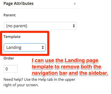
What’s the problem with your nav bar and sidebar? They’re distracting. If your goal is to get people to opt into your free content, don’t send them to a page that lets them start wandering around the rest of your site.
You might think, “But they’re interested, maybe they’ll like me and hire me immediately!”
Maybe, but they’re much more likely to check out your About Page, click around your blog, remember an email they have to send or the task they’re supposed to be working on and close your site without giving your opt-in a second though. Another potential subscriber, gone.
(Please don’t fool yourself into believing that the “right people” will opt in no matter what. We’ve got a million things on our to-do lists, an infinite number of blog posts and cat videos to get caught up in, plus an entire world that’s offline! Remember that world? I do . . . but just a little. You’ve got 5 seconds of my attention, MAX. Don’t waste that time with links in your sidebar.)
Keep the Flow Simple for the Sake of My Eyes
We’re trained to read left to right, top to bottom. Make sure your landing page is formatted to help me do just that.
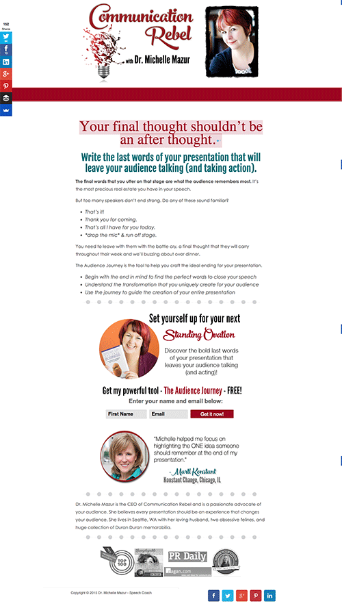
See how simple the flow of information is from top to bottom? This page by Dr Michelle Mazur is easy to read thanks to her layout plus the use of headlines, sub-headers and bullet points.
This may seem like really basic advice, but you have no idea how many landing pages I see with graphics and text all over the place. My guess is that people try to make their pages more appealing to the eye, but this actually backfires. If my brain doesn’t understand immediately where to look, your headline may lack impact because I’m distracted by something else on the page.
It’s the same concept behind removing your navigation and sidebars: keep it simple. Having an image is fine, but make sure it complements the rest of the page’s design and isn’t there just because you’re “supposed” to have images on your page. (I don’t subscribe to the “your site needs colorful, attractive images” line of thinking. They just don’t fit with the how-to tutorials you find on my blog.)
If Your Page Isn’t Truly Mobile Responsive, You’re Screwed
Does your landing page look awesome on your cell phone? I’m not asking if it fits – I want to know if it looks GOOD. If I can read the text without having to awkwardly zoom in and then scroll side to side, then yes, it looks good.
This is another extremely important thing to keep in mind in the early stages of creating your site, and yet TONS of people forget about it entirely.
Here’s the thing: probably 80% of the people I work with get more and cheaper subscribers from their Facebook ads when they’re shown on mobile devices. Why? Part of it has to do with the fact that (for now), running ads on mobile phones and tablets is cheaper than running the same ads on laptops or desktop computers. So if it’s cheaper to serve ads on mobile, that means cheaper clicks over to your landing page.
But if you’re paying for clicks on mobile, cheap or otherwise, you better make sure everything looks fantastic over there. I want to be able to get the gist of the page very quickly, enjoy a quality design, and have zero obstacles to give you my email address. (And zooming in and out with my fingers equals a major obstacle.)
FYI: all Leadpages designs are mobile responsive. My guess is that lots of other landing page providers offer this as well, but I can only speak from my experience with Leadpages and my own mobile-responsive website theme. (All StudioPress themes look absolutely bangin’ on mobile; check ‘em out here if you’re in the market for a gorgeous yet professional look for your website.)
Don’t Make Me Work to Find the Most Important Information
If you can, try really hard to keep the most compelling copy (like your headline, informational bullet points and call-to-action) above the “fold.”
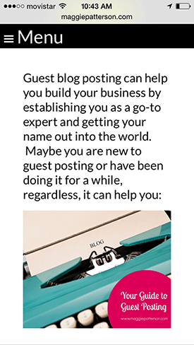
What’s the “fold”?
It’s the bottom part of my screen that I can see BEFORE I have to start scrolling. Check it out:
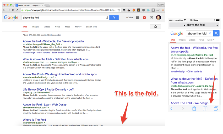
If you can get your opt-in fields and/or button above that fold? BONUS POINTS!
Now I know this can seem almost impossible, especially when you need more than a handful of words to describe the benefits of signing up for your free content. So let me offer this little tip: include more than one call-to-action and opt-in form: one above the fold for anyone already convinced by your unbelievably compelling headline, and another further down after the end of the copy.
I know it seems like I’m constantly plugging Leadpages, but there’s a reason: their templates really do convert visitors. And many of them are designed to keep all if not most of your copy, calls-to-action and opt-in forms above the fold on desktop AND on mobile!
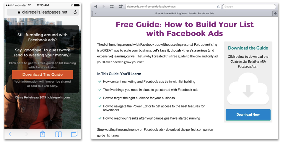
Note: if you can only have one opt-in form on your page and you can’t keep everything above the fold, put your call-to-action and form at the end of your copy (like on Michelle’s landing page above). It just makes more sense to the reader in terms of the flow of your page. If I get to the end of your landing page and don’t see a way to sign up, chances are I’m not going to scroll back up to look for instructions. I’ve got shit to do! Candy Crush awaits, so don’t make me have to search in order to take action.
“But Claire, I just can’t implement all these changes.”
I get it: lots of times the theme you already paid for doesn’t let you remove the navigation bar or you feel like you just can’t afford/don’t want to pay for Leadpages.
I have two thoughts on this objection:
- Implementing small changes can make a big difference. If you can’t put all the above changes into place, do what you can. Just make sure you know what the conversion rate of that page was before you start driving traffic to the new one. The point here is to see improvement, and you can’t if you don’t know how your page was converting in the first place.
- You’re paying to run Facebook ads, aren’t you? Or you plan to, right? WELL THAT COSTS MONEY, TOO. So if you won’t invest in some way to improve the conversion rate of your page, you are literally throwing away money on those ads. Go back to Part One of this series on landing pages that convert if you need a reminder about how your money goes MUCH farther with a high-converting landing page.
Let me know how it goes.
If you make some tweaks to the design of your landing page and see a change in your conversion rate (good or bad), I’d LOVE to hear about it.
Shoot me an email at info@clairepells.com with some before and after data and I’ll help you improve it even more with a free landing page critique.
In Part IV of the Landing Pages that Convert series, I’m going to address the most important words on your landing page (and how most people get them all wrong). Not on my list? Sign up below and make sure the rest of this series gets delivered straight to your inbox.


Super duper! Thanks, Claire! I’ve been making a list of things I would want incorporated into it if I did a website redesign. In reading this article, it occurred to me that I don’t just need a page template for landing pages, I can actually make it one like LeadPages that is laid out in a particular way to keep the opt-in form above the fold.
For anyone frustrated that they can’t make these changes with the simple html editor they use on their pages, for most websites you can easily hire someone to go in and tweak some CSS (designy code) to make a page do what you like. I do this all the time when an image isn’t laying properly around the text or if I can’t get the optin code from email marketing provider to look right. Usually only costs a few dollars and maybe 30 minutes of a developer’s time.
Laura, thank you SO much for pointing that out! You really don’t need to pay for something like Leadpages, especially if you’re not creating new landing pages all the time. Do you have anyone you would recommend to people who’d like to tweak their landing page designs?
Nikole at That Super Girl is very reliable, quick, and can take an idea and run with it (with gorgeous results). But if I know exactly what I want, it’s cheaper to get a straight-up developer. I have a guy, but he doesn’t have a website and I hesitate to put his email up publicly. If anyone wants it, feel free to drop me a note and I can email it to you. I never ask my developer to make design-y decisions and I know that I’m only paying for him to code what I tell him to code exactly. You have to be super specific. With Nikole, I can be totally vague. I think last time I told her “That image just isn’t lining up well and the optin form doesn’t look right.” and she went in and made it all look pretty without any further direction. Worth it.
Awesome, thanks Laura! Funny story, I’m currently working on a project that Nikole is on too but I had no idea I could go to her with that kind of stuff! Great to know that I can recommend her in the future.
I also agree that for anyone who knows exactly what they want, going to the developer route will probably be the most cost effective. I might get his name from you soon! :)