I’m reviewing real Facebook ads! And so I can’t stop repeating this in my head:
“Reviewing, reviewing, reviewing…something for you!” – The Daily Grace
(If you get this reference please tweet me so we can be best friends and collectively waste our entire evenings on that YouTube channel.)
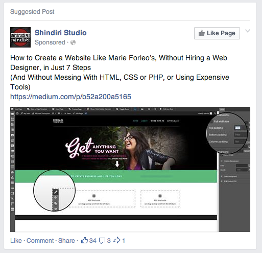
Some ads just really jump out at you, both the good and the bad. Here’s one I spotted over the weekend that I couldn’t stop talking about over breakfast today:
What’s being advertised here?
This ad is driving traffic over to a blog post on Medium written by Mladen Stojanović, the marketing guy over at Shindiri Studio.
Who is the ad targeting?
My guess (and this is really just an educated guess because I don’t have the inside scoop on this company’s strategy) is that this ad is targeting people who like Marie Forleo on Facebook. I could be wrong, but since I like Marie’s page and the copy of the ad is related to Marie Forleo, it’s not that far-fetched an idea, you get me?
What’s the end goal of this ad?
To get people to purchase a specific Wordpress theme that plays a key role in the tutorial.
WHOA, UPDATE:
Just 2 days after I spotted this ad, the post on Medium is gone. The author gives his explanation here, but my guess is that the ad got in front of Marie’s fans and tipped off her team about it. Do I sense some trouble in the land of copyright?
What worked about this ad:
I have to say I’m glad that post was taken down. It left me with the distinct taste of sketchy marketing tactics in my mouth.
But the same thing that made me cringe is what probably worked really well: the ad copy. It reads:
How to Create a Website Like MarieForleo.com, Without Hiring a Web Designer, in Just 7 Steps And Without Messing With HTML, CSS or PHP, and Without Using Expensive Tools
Like it or not, the first part of this copy speaks to a very specific desire held by some people in this target audience: “How can I make my website look as awesome as Marie’s without shelling out tons of money?”
According the online groups, forums and blog comments sections I hang out in, web designers get this request all the time: a website that is similar to, or has the same look and feel as, Marie Forleo’s. The Internet is full of crappy web design, so it can feel like a breath of fresh air when you happen upon a website that makes you feel really good while you’re browsing around there.
Combine that feeling with the fact that Marie has been killing it in your industry for a number of years? It’s a classic case of “I’ll have what she’s having,” and here it means Marie’s gorgeous design.
Essentially Mladen identified the actual language that his potential customers are using, and turned it into a headline and then an ad that made it virtually impossible for me not to click on.
What didn’t work about the ad:
Possible copyright infringement is perhaps the obvious objection! But beyond that, I have two issues with this ad:
1. It was a huge mistake to spend money on driving traffic to someone else’s blog. Sure, Mladen published the article on Medium, but you can’t even get traffic data about blog posts that aren’t on your own blog.
2. The second part of the ad copy was unnecessary. The terms HTML, CSS and PHP are all too technical – they’re just going to confuse people who are in the market for a simple way to get a fabulous website.
Here’s what I would do next:
The post Shindiri Studio was driving traffic to was unbelievably detailed – it’s a shame you can’t read it now. If I were part of their team, I would tweak it so that it doesn’t focus so much creating a copy of Marie’s site. They could easily rework it to make it a guide to designing a website with a really friendly interface that brings in conversions.
Then I would turn the post into a free giveaway for people who sign up for their list, and drive traffic to that landing page instead of hosting in on a blog. That way they could grow their list and hopefully turn leads into customers.
Here’s the catch: the tutorial is really only relevant to people who purchase that specific Wordpress theme, and not everyone who opts in to get the tutorial will become customers. So they would need to be conscious of the ROI of their Facebook ads – how much would they need to spend in order to land one sale? If they make more money from those ads than they spend on them, then they’ve got a profitable sales channel.
PRO TIP: You should be asking yourself that same question when you’re thinking about running ads: how much can you spend per email sign-up for Facebook ads to be profitable for your business?
Show me where you stand.
I’d love to hear your thoughts on this issue. How did that ad make you feel when you saw the screenshot? Do you see why those tactics might work? Does your own copy speak to what your ideal customers really want deep down, even if it may be hard for them to hear?
Let me know what you think in the comments below, or shoot me an email at claire[at]clairepells[dot]com!




Great post Claire! You nailed it from A-Z in my opinion. I remembered a similar ad that I set up, in that I mentioned a well-known marketers name and targeted it to fans of his page. Just went to have a look in my FB Ads account and realized I had scheduled the ad for 7 Nov 2013 but for some reason never ran it :P
OMG Rich I would LOVE to see that ad and the results. Could you start running it now? The suspense is already killing me. :)
Keep us all posted!
Yeah, that copy made me cringe too. I can also see how it would work.
As always, awesome insights.
Hi, Claire. I’m Mladen, author the post you mentioned and author of the ad. :)
Wow, I’m so glad this post and this ad inspired you to write a post about it. :)
Let me just clear a few things here. The tutorial is NOT deleted because of copyright issues.
After few days, I was contacted by Marie’s support team, and they raised their concerns that some people (that means a lot of people :)) might use this to clone the Marie’s blog, rather than using it as inspiration.
And since I have huge respect for Marie Forleo, and since her support team was very kind and helpful, I decided to take it down.
I agree with you, Claire. This post should be on our blog, rather on Medium. But, at the time of writing, our blog was under development. That’s why we choose Medium as a temporary solution.
Nevertheless, that tutorial and that ad brought 600% ROI for the product mentioned there.
If you, or your audience have any more questions, I’ll be happy to answer here, or via email.
Hope that you’ll check our new blog. :)
Best,
Mladen
Hey Mladen,
So awesome to have you here on the blog! Your tutorial was so phenomenal in terms of detail, I hope you’ve got it (or something similar) up on your blog now.
And congrats on that ROI! I really meant it when I said that it was a terrific ad, I’m really glad you guys got good results.
I guess I kind of wonder about the whole copyright thing. Maybe you’re right, maybe you guys were still on the legal side of things, but I’m wondering if you could have gotten in trouble had you not taken down the tutorial.
Anyway, keep me posted about any other ads you’re running or other things you see working for your business when it comes to paid campaigns!
Right after I took down that tutorial, I wrote a new one, with almost same content: https://medium.com/p/528d399f46f0 (hope you don’t mind that I share link here).
I think we couldn’t get into legal problems, but we would ruin any chance that maybe in the future we work on some level with Marie.
Don’t worry, I’ll let you know. If you want to follow our work, you can sign-up on our blog and get notified on new things (and get free eBook that you’ll love). :)