As a reader of this blog, you may already be aware of Facebook’s 20% Text Rule which states that ads may not include more than 20% text in an image (including logos and slogans).
When I first learned about this rule, I thought “How do I know if text takes up 20% of my image? Do I have to do some sort of math to figure this out?”
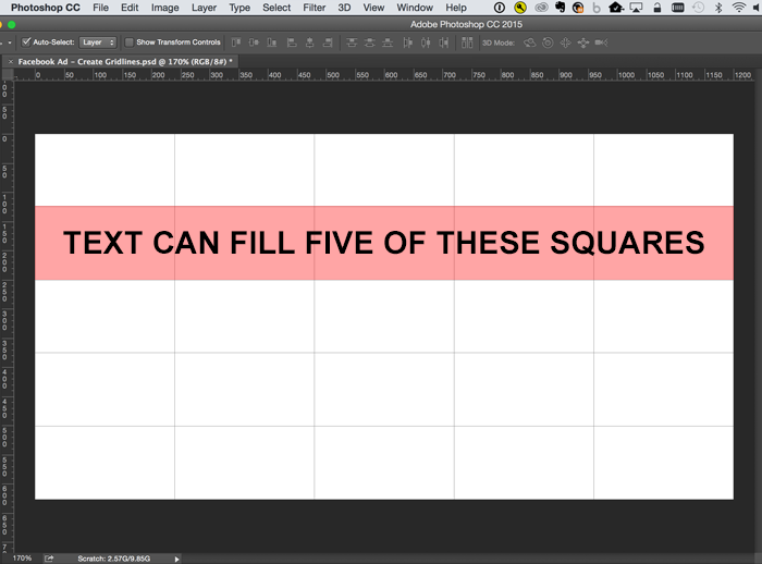
Then I learned about the “grid tool” that helps you figure out how much of your image is covered in text. It’s a 5×5 grid that you lay over your design to determine how much of the area is filled by your text. According to Facebook you can only have text filling five of these squares.
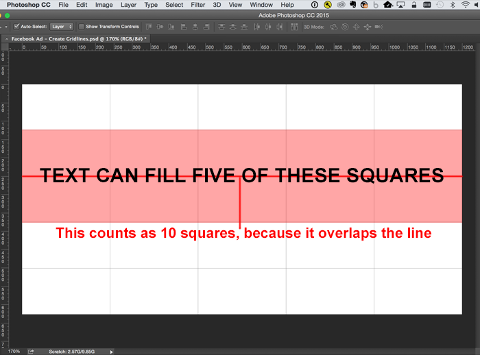
I thought that was great because then I could estimate how much text to fit into my design and meet the Facebook requirements. But what I didn’t understand (and was shocked to discover) is that your text has to align exactly on the grid itself. You can’t just look at the size of five boxes on the grid and use that size to figure out text area. The text has to sit exactly inside those boxes.
This means if a letter hangs down, or the words are straddling a grid line, Facebook counts this as more boxes.
This limits our layout options quite a bit and is a bit of a nuisance. If Facebook had a grid with more, smaller squares, we’d have way more options! However, once you know the rule, at least you are armed with the knowledge you need to create a design that fulfills that 20% text requirement. And with that knowledge, now you’re ready to start digging into design!
Why Photoshop is Better than Canva for Your Facebook Ads
Photoshop is an amazing powerhouse and a program like Canva can’t ever measure up. Don’t get me wrong, I actually like Canva! Canva is free (there’s a paid version too) and really fun to use. I use it quite a bit for quickie social images and fun typography inspiration, but for serious work I always turn to Photoshop…and it’s not that expensive. You can get Photoshop CC (Creative Cloud) and Lightroom CC for only $9.99/mo on their Photography Plan. If you’re on the fence, try the Photoshop Free Trial and then decide.
(Note from Claire: if you’re not going to outsource the design of your ads, I beg you to learn to use Photoshop for super simple image-tweaking like Sarah explains below. When you design Facebook ad images in Canva, they almost always look amateur. This can seriously affect the cost of your results.)
Once you have Photoshop, it’s a snap to create a new file and tweak preferences to add the 20% grid right over the top of your design.
How to Create the Facebook Grid in Photoshop
Now that you understand how the grid works, let’s talk about how to add it to your Photoshop file. It’s really easy!
Step 1:
- Open a new Photoshop document with these dimensions: 1200×628.
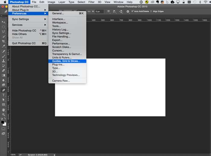
- Click on “Photoshop” in the top menu bar.
- Click “Preferences.”
- Then click “Guides, Grid & Slices…”
Step 2:
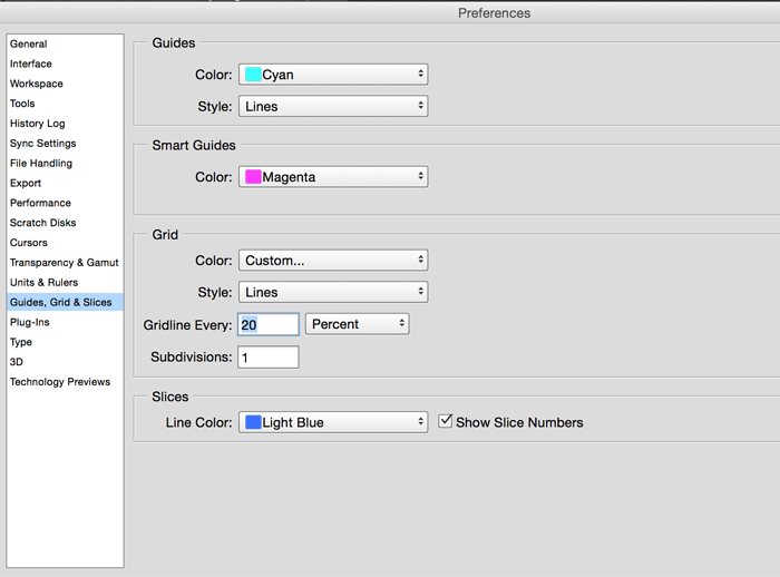
This opens the Preferences window with Guides, Grid & Slices pre-selected on the left side. Use the following settings:
After you hit OK, you’ll go back to your main file and the gridlines probably aren’t showing yet. You’ll need to turn them on to make them appear.
Step 3:
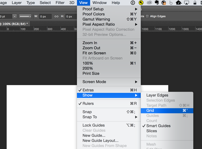
- Click on “View” in the top menu.
- Scroll down to “Show” and select “Grid.”
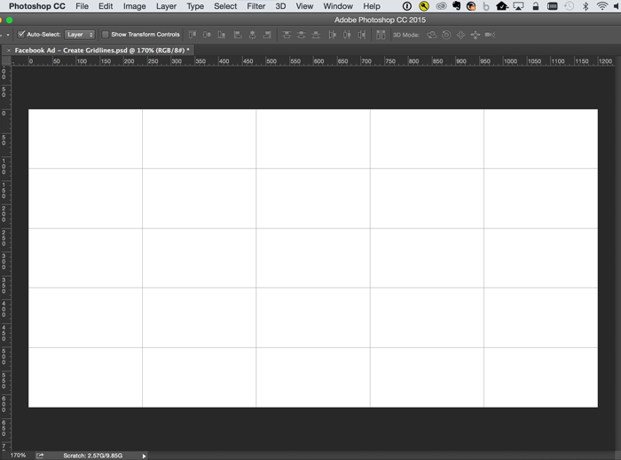
Voila! Your gridlines appear!
Now let’s go over a few Photoshop basics.
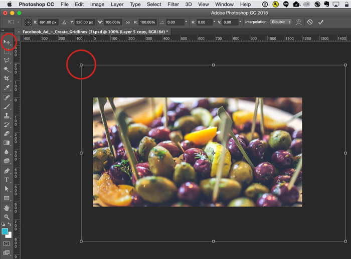
To add an image, all you have to do is drag one onto your white background and play with the corners to resize it. Make sure your arrow tool (the tool circled in the upper left corner) is selected. If you don’t see the corner boxes for resizing your image go up to your menu and choose Edit > Transform > Scale. Then grab a corner of your image and drag to resize while holding down shift at the same time to keep the shape proportions.
Next, we’ll add a shape to put text on top of. You don’t have to do this step, but since our background is busy, the text would be hard to see without a nice solid colored shape behind it.
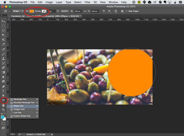
Over in your toolbar you’ll see a little shape just above the hand icon. It usually defaults to the rectangle shape, but will be whatever shape you picked previously. (If you have never used it before, it will be a rectangle.) Click and hold the rectangle icon and a little flyout menu appears with other shape options. Choose the Ellipse (oval). Then in the top menu choose a color in the Fill box. I chose orange. The stroke (“stroke” means “outline”) can be blank with the little red line through it. Then draw your shape and place it wherever you want on the image.
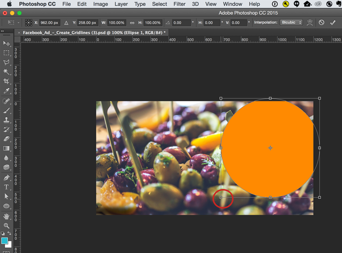
If you need to resize the shape after drawing it, just transform it like we did in the step above. By going to Edit > Transform > Resize, and using your arrow tool to drag the corner or the shape as desired.
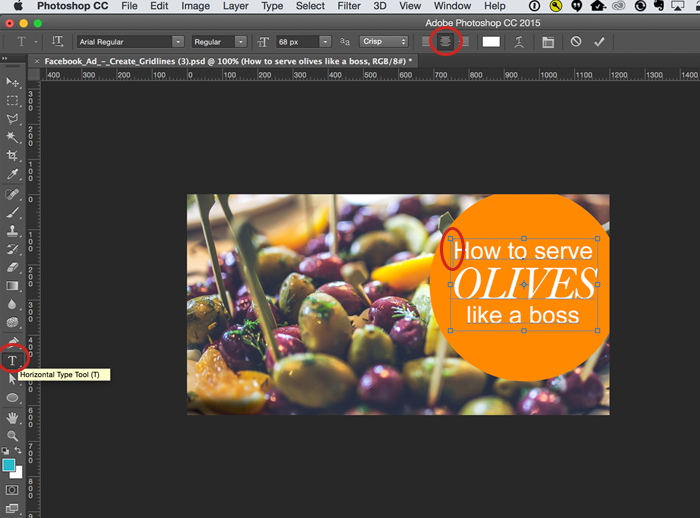
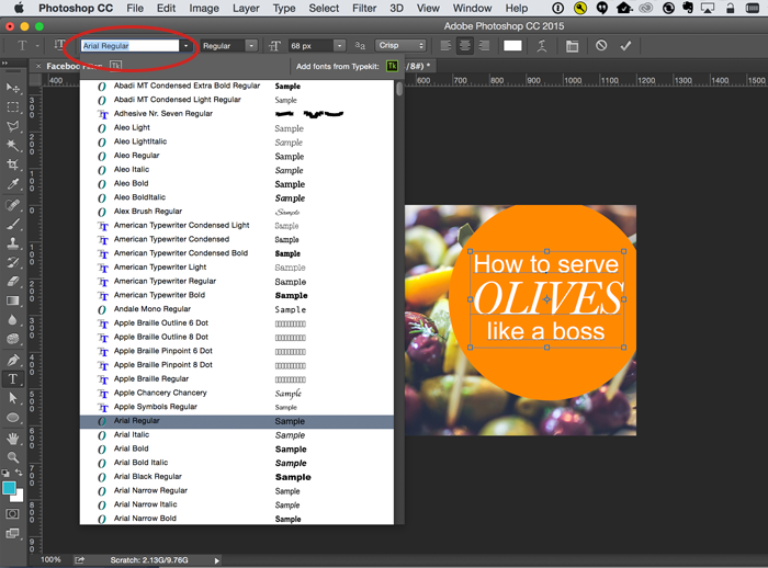
Now it’s time for text. Click on the Text tool in the toolbar (looks like a T), then click on your screen. You can click right inside the orange shape, but sometimes that does strange things to your text. So I suggest you click somewhere else on the olive background and start typing. Then use your arrow tool to drag the type on top of the orange shape and continue editing it there. You’ll notice there’s an option in the top menu to choose your alignment. I went with center alignment on the text to fit in the circle shape.
When you want to edit text, just use that same text tool and click inside the text and a big cursor will appear (I circled it in the image example) and then you can start typing, just like you would with any word processor.
To change the font family, click in the top menu where the font is listed. There’s a small white arrow next to the font. If you click that, a menu listing all your font options flies out. Just drag down until you find the one you want and click it. If you know what font you want ahead of time, you can start typing the name into the box where the font was listed and it will go to your font automatically.
Designing Beautifully Within the Grid
Now that your grid is set up and you have some Photoshop basics under your belt, you can easily go in and get to work!
Next up: figuring out where your text can go. The design possibilities are limitless but there are a few techniques that I recommend when you’re getting started:
- Text overlay on shape
- Obvious CTA/Button
- Face the call to action (CTA)
Text overlay on a shape
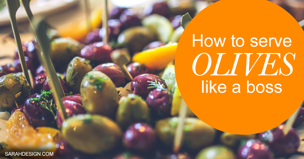
Olives example:
You already had a sneak peek of this design in the Photoshop basics section above, but now I’ll break down all the design thinking that goes into this and two more examples.
In this example, I added a large orange circle behind the copy that I want you to focus on. This helps it stand out over a pretty busy image, and it stands out well in a sea of Facebook posts too.
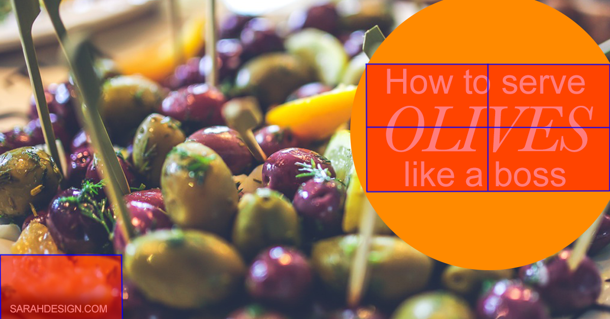
The grid:
Following my gridlines, I was able to fit the main headline into four boxes, and put my URL in another box in the bottom left corner.
Obvious CTA/Button
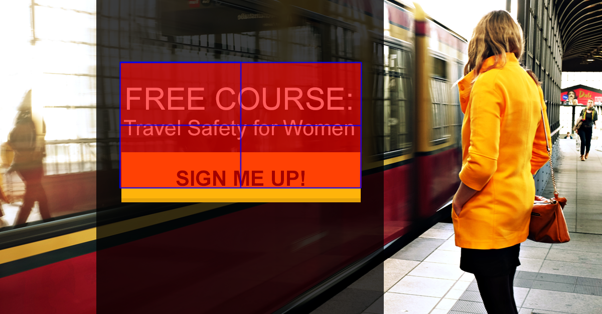
Travel Example:
- Here I have a large button in bright yellow which picks up the color of the woman’s jacket. It’s huge, and has a strong “Sign me up!” call to action.
- The image itself supports the topic “travel safety for women” with a scene showing a woman waiting for a train, and a hint of a mysterious stranger off to the right in the distance (where she is facing).
The grid:
- I fit the text and CTA within four boxes on the grid. I could even use another box to slip in another CTA if I wanted.
- Notice that the button itself overlaps more boxes, but the text piece doesn’t. So we’re safe!
Face the call to action
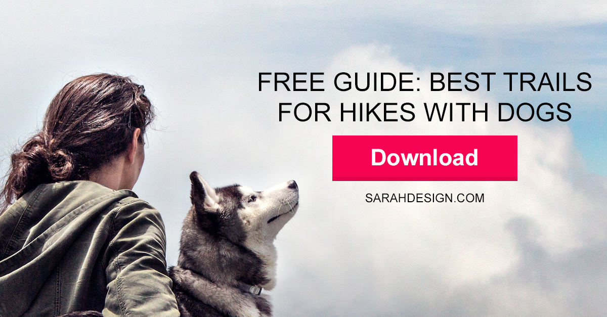
Dog Hikes example:
A handy trick you can use for images with faces is to have the person or animal facing the call to action. So you can see that their eyes are looking right at it. It makes YOU look at it too.
- Here we have the dog clearly looking at the big magenta “Download” button.
- The scene – someone out with their dog – fits the message of a guide for trail hikes with dogs.
- This combined with the dog looking right at the CTA is the perfect lure for outdoorsy, dog-loving hikers. They’ll be signing up in droves. :D
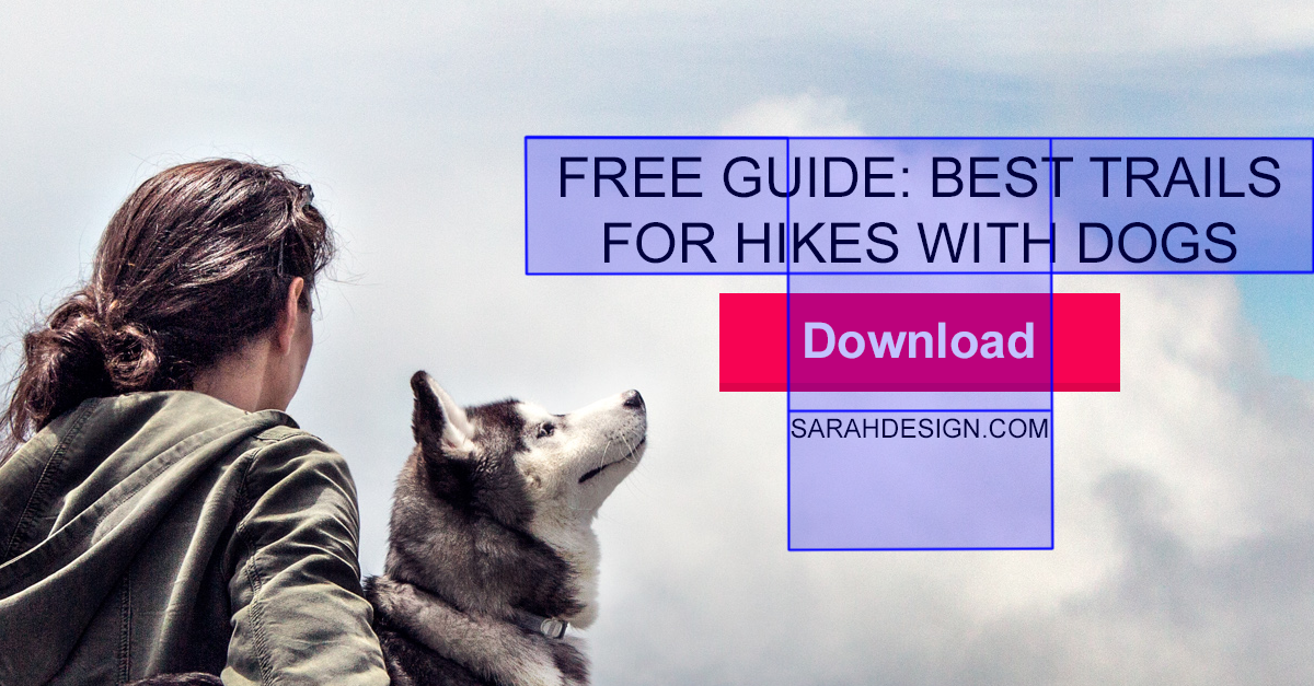
The grid:
Stacking the text in a “T” shape fits everything within the allotted 5 squares.
Hopefully now you’ll feel better about using Photoshop to create Facebook ad images that pass the 20% test. I want you to have wild success with your designs so I made a freebie to help you get started! I put together a PSD with all the above examples and included buttons, all pre-sized, editable, and ready to go for your next Facebook ad. All you have to do is pop over to my website and pick up the Photoshop file.
Download the Photoshop file here >>>
About the Author
My name is Sarah Guilliot and I’m a professional designer, helping Etsy shops succeed through the use of Photoshop mockup templates. I specialize in silhouette-cameo based shops who create personalized products like etched and vinyl decorated glassware, tumblers, and mugs. Save time, materials, and money by creating your own product photos with custom mockup templates.
Interested in learning how to create better Etsy product images? Click here to try out my FREE e-course, 7 Days to Better Etsy Images.



This article is incredibly helpful! Thank you.
That’s music to my ears, Tamara! I’m around if you’re ever stuck in Photoshop too :D
Hi Claire, your site is a godsent.
I believe my case to be a useful scenario for your coaching work.
I started FB advertising for my local business a week ago, on Thursday July 7th 2016. I designed my creative according to the set standards and guidelines and launched my campaign with two pilot experiments with a budget of $5 and $10 accordingly. After reviewing my data, I narrowed my audience to females 18-44, over two cities with a 25 mile radius each and a schedule of 3pm – 12am.
The next day, Friday the 8th, I was surprised at the results of my second experiment, with a huge spike in reach and engagements, even though I only had less that 300 Likes to my site. The best outcome however, was that 22 people actually contacted us directly, which was our main goal. As you can see from my images, the budget was at 10 dollars for each campaign, only lasting 7hrs each.
That night, after playing around with the data, I decided to narrow my audience to Females 18-34 and used those parameters for Saturday July 9th’s campaigns, which would only last 1 hour each.
Those two experiments and the pilot, got me 50,000+ reach and 2,500+ engagements. But the best yet, is that 44 people contacted us directly and many became clients.
We decided not to push any more ads until Tuesday the 12th, and even then we saw a slight growth in our follower bases and even more direct messages turning into clients.
Sadly, our streak was crushed. Each and every ad we launched on Tuesday July 12th stalled to nothing or near nothing. Facebook wasn’t spending any of our budget and our social clout became decimated. I tried tweaking everything and devoured the help forums to no avail.
On Wednesday the 13th, a FB message announced a malfunction with our scheduled post and we discovered a glitch after manually posting it. The boost button was blurred out, with a dropdown message telling us that “Cannot use draft posts in ads”. The situation hasn’t changed.
We are still slumped with our budgets at a minimal spend…no reach, no engagements, no messages from interested clients and, most frustrating of all, no answers.
I attach the screenshots. If you see no ads on the 12th, it’s because we tried deleting them to see if that would fix the problem.
I hope you find this useful our case useful and would love to read your feedback.
Thank yo.
– Oskar
https://uploads.disquscdn.com/images/7df719c55fc497935344656cf41e684afc43ef313bc4659dad353e423f986cae.jpg https://uploads.disquscdn.com/images/77631384a286a43c8bc44ff8ecbc81b03958d39d55755d371a86e942c66716f2.jpg
Facebook Ad Tutorial on Photoshop
https://www.youtube.com/watch?v=4CmWZpTpbAc&t=271s
great