If you asked me how to create Facebook ad images back in 2014, I would have said one thing without hesitation:
Use a picture of yourself.
Get someone to take a nice photo of you, add a circle or something that looks like a button, put some text in that circle, and you’re set.
But I’m afraid the days of “any ol’ picture of you will do” are over, and that advice of mine is PLAYED OUT.
Don’t worry, though. You don’t have to be an amazing graphic designer to run ads that get clicks.
I’ve noticed a specific trend in Facebook ad images, and I’m happy to report that it’s actually going to make your Facebook ad creation job a LOT easier.
What’s the trend?
Images that don’t necessarily have much to do with the content of the ad.
“Wait, WHAT??? Claire, are you pulling my chain over here?”
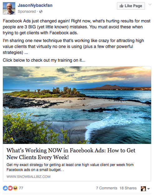
OF COURSE NOT. Take a look at this ad as an example:
 If you skim the ad copy and headline (which is probably the most attention people are giving all that text you included), you’ll see there’s no mention of superheroes, saving yourself, saving other people or saving your business. If you’re someone who pays attention to ads with a critical eye, you’d likely wonder what on earth the connection between the offer (a free webinar) and this image.
But my point here is that it doesn’t matter if there’s a connection or not.
This is what matters:
- The image is appealing. It’s not out of focus or clearly shot by an amateur photographer. The colors are nice, and the girl with a cape and a mask triggers your imagination before you even notice there’s no real connection between the message and the image.
- It’s not outside the realm of what we expect to see while scrolling through Facebook. Guys, this is IMPORTANT. Facebook ads are a type of interruption marketing: the ads we run are interrupting the experience of scrolling through posts by friends, families, and media or business we follow. So if your image looks really out of place, your ad will disrupt that experience and turn off users.
So What Does an “Out of Place” Ad Look Like?
Opinions will probably differ on this, but for me, it all comes down to bad design. And it’s really, really easy to create a poorly designed ad image if you’re not a professional designer!
I spend a lot of time creating poorly designed images WAY too often. Here’s one of my worst:
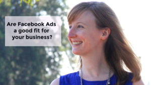
Honestly, the white box with the black text isn’t so bad, design-wise. I think the main problem here is the photo I used. Me outside, in front of some foliage, just isn’t relevant to Facebook ads and your business.
When you do create Facebook ad images with your own photo, it needs to really fit your brand. Let’s face it: this photo does NOT. Do you see other nature shots anywhere on this site? Nope.
Other pitfalls of DIY ad design are:
- colors that don’t match
- fonts that don’t fit your brand
- or a combination of the two!
More Examples of Random Images in Great Ads
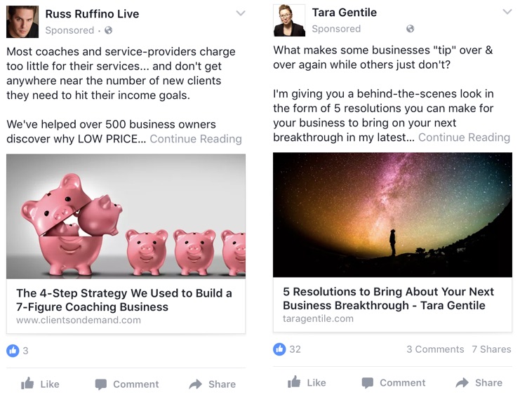
Here are a few more ads that I’ve spotted over the years that push the boundaries of image-message correlation:
Check out all the engagement on that ⬆️ ad! I’m currently obsessed with this technique to get likes and shares on ads, in case you want to try it out for yourself.
How to Test This In Your Next Campaign
If you haven’t already experimented with this kind of attractive-but-not-really-related-to-your-offer images, give it a try in your next campaign. I recommend you run two ads in the same ad set with identical copy and two images:
- an image of you with some text overlaid on it (this post should help you design it well), and
- a gorgeous image that may or may not be related to the text of your ad (bonus points if you can make a connection between the two!) with no text on it.
One of your ads will get more clicks and action on it, and Facebook will stop showing the ad that doesn’t perform too well.
(Read more about split testing Facebook ads in this post.)
Once you’ve run that test, let us all know which image won in the comments below!



Interesting idea. I didn’t do the comparison. I have some other ads that just finished so I can compare to those. We will see how the visually pleasing pic with minimal text performs :)
Great post! Struggling with design myself. Who knew eye-catching Facebook Ads could be so easy with templates and free tools? Can’t wait to try these tips for my next campaign! For more valuable resources and services similar to our discussion, explore https://bawejamedia.com/